Designing the last safe step between an opioid and a patient.
End-to-end UX for a Patient-Controlled Analgesia (PCA) infusion pump — from platform and competitive research, through clinical workflow analysis, to care-area interface flows evaluated on the actual device hardware.
- Audited the PCA pump against large-volume and syringe pump platforms: clinical features, ~50 alarm states, and user options across North America and rest-of-world launch lines.
- Analyzed 10+ manufacturers in a market heading from $484M to $834M by 2035 — safety tech and connectivity are the battleground.
- Translated a real oncology nursing workflow into device flows for three care areas, with hard safety gates: blind weight re-entry, second-clinician verification, pre-infusion line checks.
- Evaluated the flows on device hardware and surfaced issues invisible in Figma — including missing input-focus feedback — with concrete fixes.
A device that gets zero benefit of the doubt
A PCA pump hands part of the control of an opioid infusion to the patient: press a button, receive a small analgesic bolus. A programmed lockout interval and hourly maximum are what stand between pain relief and overdose.
That makes the interface itself a clinical safety control. A typical prescription from this project — morphine 1 mg/mL, 1 mg bolus, 10-minute lockout, 6 mg/hour maximum — is programmed by a nurse on a keypad, at the bedside, often mid-shift. Every screen either reduces the chance of a wrong dose or quietly increases it.
This project ran end to end: understanding the product class and platform, studying how competitors handle the same risks, grounding everything in a real clinical workflow, designing the programming and monitoring flows for three care areas, and then testing those flows on the physical device rather than trusting the design file.
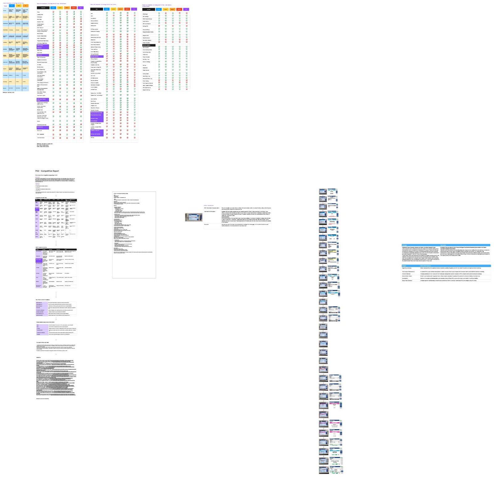
Learning the machine before designing for it
Infusion pumps are a family, not a single product. Before touching a screen, I mapped where the PCA pump sits inside that family — and what it inherits, drops, and adds.
Three pump classes, three different risk profiles
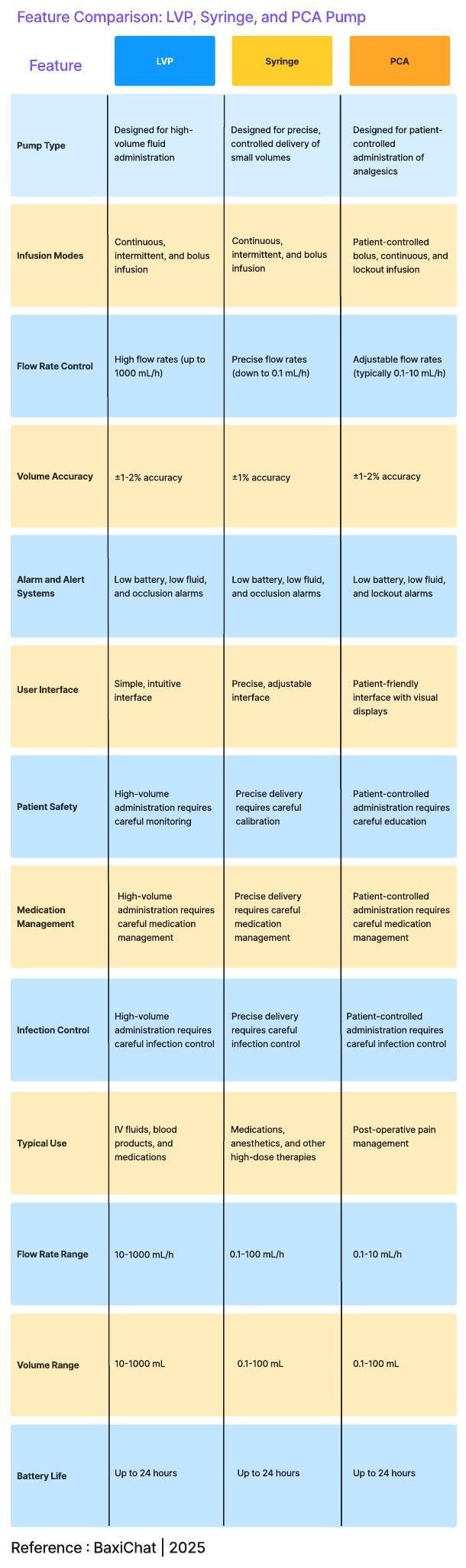
I compared the PCA pump against large-volume pumps (LVP) and syringe pumps across pump type, infusion modes, flow-rate control, volume accuracy, alarms, interface, and typical use. The defining difference isn't throughput — LVPs push up to 1000 mL/h, PCA works in the 0.1–10 mL/h range. It's that PCA is the only class where a patient operates the device. The moment the bolus button exists, the interface stops being a clinician-only tool.
Auditing the platform, feature by feature
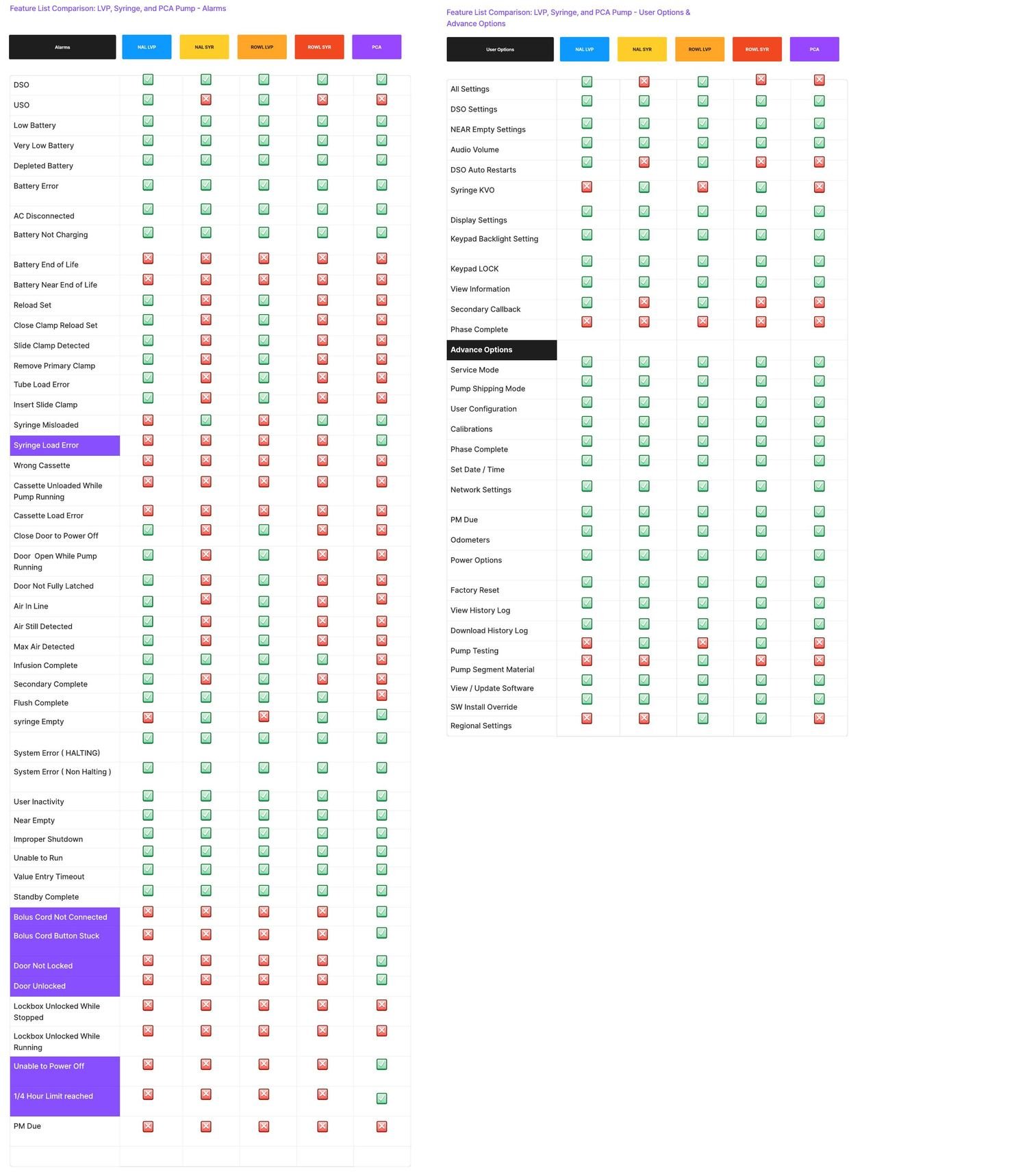
The PCA pump ships on a platform shared with LVP and syringe products across two launch lines — North America (NAL) and rest-of-world (ROWL). I audited every clinical feature, alarm, and user option across all five configurations to find exactly where PCA diverges.
The audit surfaced roughly fifty alarm states and a set of capabilities that exist only because a patient is in the loop: bolus-cord states (not connected, button stuck), the locked security door and lockbox alarms, the ¼-hour dose limit, and shift totals with dose-versus-attempt history. Each of these is a design surface the sibling products never needed.
The competitive landscape
I analyzed 10+ manufacturers — Abbott, Fresenius Kabi, Baxter, BD, ICU Medical, B. Braun, Medtronic, ACE Medical, and rising APAC entrants — with SWOT summaries, product feature highlights, and 2024–25 development tracking across 35 cited sources.
Four patterns shaped my design brief:
Safety features are the differentiator
Barcoding, dose-error reduction and guardrail software are what wins deals — not flow-rate specs. The market is heading from $484M (2025) toward $834M (2035) at 5.1% CAGR, and safety innovation is driving it.
Connectivity is table stakes
EHR integration, cloud drug libraries and remote monitoring appear across every major roadmap. Regulators are simultaneously pushing cybersecurity and AI-assisted overdose prevention.
Care is leaving the hospital
Ambulatory and home-care PCA is a stated growth direction across the market — which raises the stakes on an interface a layperson might one day face without a nurse nearby.
Recalls are the existential risk
Manufacturers are visibly wary of large product recalls tied to defective design — alarm errors and flow mismanagement specifically. Interface quality is a recall-prevention strategy.
The human problem hiding in the market data
The most important research finding wasn't about hardware. Studies of PCA adoption show that inadequate patient education quietly breaks the whole model: post-operative patients too disoriented to use the device report poor pain control in the first 12 hours; alert patients misread instructions and press the button on a schedule — roughly every six minutes — even while comfortable; and family members press it for sleeping patients ("PCA by proxy"), defeating the core safety mechanism, because a sedated patient can't self-administer.
The button is the safety system. If the person holding it doesn't understand it, no lockout interval can fully protect them.
One shift in oncology
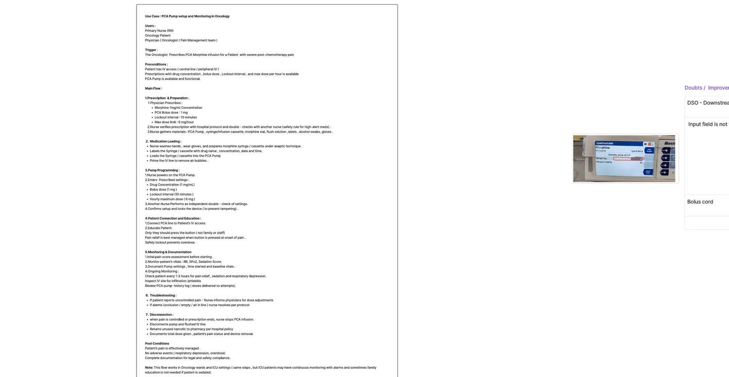
To design flows that survive contact with a hospital, I documented the full PCA lifecycle for a concrete scenario: an oncologist prescribes PCA morphine for a patient in severe post-chemotherapy pain.
Prescription & preparation
The physician prescribes morphine 1 mg/mL with a 1 mg PCA bolus, 10-minute lockout and 6 mg/hour cap. The nurse verifies it against hospital protocol — and against a second nurse.Safety ritual · independent double-check for high-alert meds
Medication loading
Aseptic preparation of the morphine syringe, labeling with drug, concentration, date and time, loading into the pump, and priming the line to remove air.
Pump programming
Power on, enter concentration, bolus dose, lockout interval and hourly maximum. A second nurse independently re-checks every value before the setup is confirmed and the device is locked against tampering.Safety ritual · second-clinician verification
Patient connection & education
Connect to IV access, then teach the three rules: only the patient presses the button; press at the onset of pain, not on a schedule; the lockout exists to prevent overdose.
Monitoring & documentation
Baseline pain score, then checks every 1–2 hours: respiratory rate, SpO₂, sedation score, IV-site inspection — and the pump's own history of doses delivered versus button attempts.
Completion
When pain is controlled or the prescription ends: stop the infusion, disconnect and flush, return unused narcotic to pharmacy per policy, and document total dose, pain status and removal.
Four insights from this workflow became the backbone of the design:
Verification is culture, not paperwork
Nurses already double-check each other for high-alert medications. The interface shouldn't merely permit that — it should encode it as a first-class flow.
The patient is an untrained operator
Unlike every sibling pump, part of this device's audience gets a 60-second briefing while in pain. Anything patient-facing must survive that.
Context defines risk
The same pump delivers morphine to a 30 kg child in pediatric oncology and fentanyl-bupivacaine on labor & delivery. Care area must drive drugs, concentrations and limits — not free entry.
Alarms are a workflow, not a sound
With ~50 alarm states, what matters is recovery: what the nurse does next, and whether the program survives the interruption.
Five rules the interface must keep
Care area comes first
Selecting the care area loads the right formulary, concentrations and dose limits before any number can be typed. Context is a constraint, not a preference.
Commit progressively, gate hard
Each irreversible step — clearing a program, priming, starting an infusion — gets its own explicit confirmation with the consequence stated on screen.
High-risk values are entered twice, blind
A pediatric weight is re-entered masked (***) so the second entry can't be pattern-matched against the first. Agreement, not repetition, proves correctness.
A second pair of eyes is a screen, not a signature
Second-clinician verification is its own guided sequence — drug, program, volume confirmed independently — not a checkbox at the end.
Never alarm without a way out
Every alarm state pairs detection with recovery guidance, and the pump resumes where it left off once the cause is cleared.
The flows, care area by care area
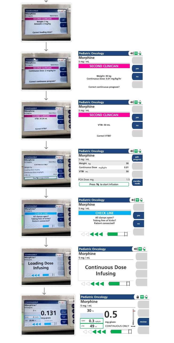
The programming journey was designed and documented as complete screen-by-screen flows for three care areas — Critical Care Adult, Labor & Delivery, and Pediatric Oncology — each screen paired with its state on the physical device.
Start clean, start in context
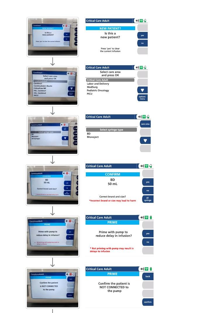
- New-patient gate. The first question — "Is this a new patient?" — exists to clear the previous infusion program. Stale settings are the cheapest error to prevent and the costliest to miss.
- Care area selection from a fixed list — Critical Care Adult, Labor & Delivery, MedSurg, Pediatric Oncology, PICU — loads the matching drug library and limits.
- Syringe verification. Brand and size (BD Monoject, 50 mL) are confirmed explicitly, with the consequence spelled out: an incorrect brand or size may lead to harm.
The most dangerous screen is the quietest one
- The disconnection gate. Before priming, the pump demands: "Confirm the patient is NOT CONNECTED to the pump." Priming into a connected patient is a free bolus — this single screen is the highest-stakes moment in setup.
- Press-and-hold to prime. A sustained physical action, not a tap — deliberate by design, with live priming and syringe volume readouts.
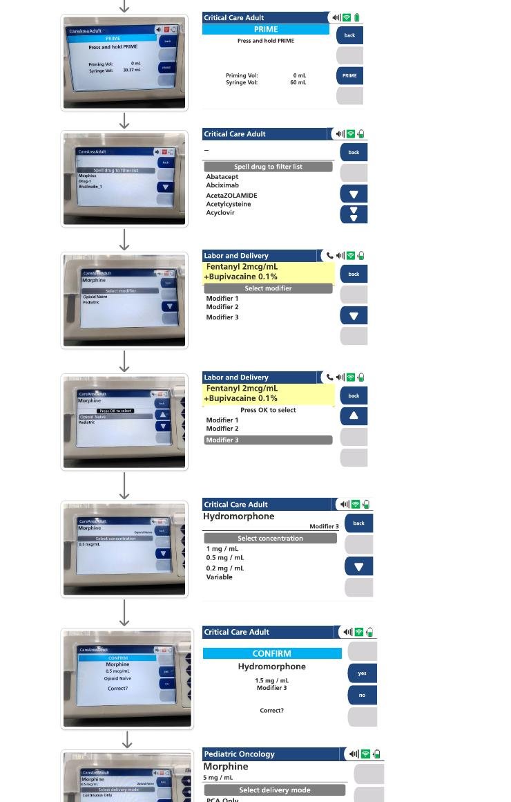
- Spell-to-filter drug library. On a keypad-driven device, typing the first letters filters the formulary — faster and safer than scrolling an alphabetical list of hundreds of drugs.
Constrained choices per care area
- Care-area formularies in action: Labor & Delivery offers fentanyl 2 mcg/mL + bupivacaine 0.1% with its modifiers; Critical Care Adult offers hydromorphone at fixed concentrations (1 / 0.5 / 0.2 mg/mL) or Variable.
- Explicit delivery mode: PCA only, Continuous + PCA, or Continuous only — chosen up front, because it changes what every later number means.
- Loading dose as an offer, never a default: "Would you like to program a loading dose?"
Weight-based dosing with zero trust in memory
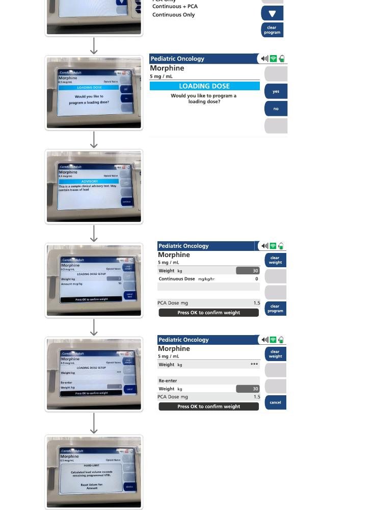
- Everything keys off weight. In pediatric oncology, morphine 5 mg/mL is dosed as mg/kg/hr against the entered weight (30 kg in this flow) — so the weight is the most dangerous number on the device.
- Blind re-entry. The weight is entered a second time, masked as ***, and the pump compares. A transposed digit can't be confirmed by glancing at the first entry.
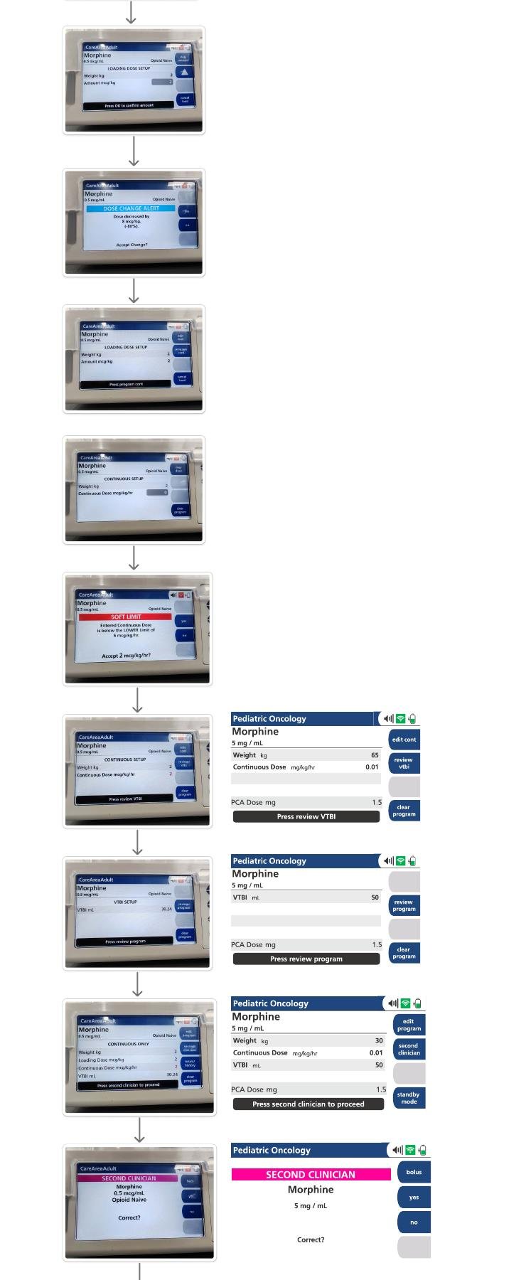
- Structured review, then handoff: continuous dose (0.01 mg/kg/hr), VTBI (50 mL) and PCA dose (1.5 mg) are reviewed in sequence, ending with "Press second clinician to proceed."
The second clinician gets their own interface
- Independent confirmation sequence: drug and concentration → weight and continuous program → VTBI, each on its own screen with a plain yes/no. The verifier checks values one at a time instead of skimming a summary.
- CHECK LINE before start: all clamps open, tubing free of kinks, patient connected — the physical world confirmed last, right before the infusion begins.
- An honest run state: the running screen shows weight, current rate (0.3 mg/kg/hr), mg given, VTBI remaining and mode at a glance — the same numbers the nurse documents every 1–2 hours.
Where Figma and the hardware disagreed
Every flow was walked through on the physical device — because a medical UI isn't finished when the design file looks right, it's finished when it works with gloves on under ward lighting.
The active input field is invisible
The design looked clear and visually appealing in Figma. On the device, it was genuinely difficult to tell when a field was ready for input — no visual indicator signals that a field is active and accepting data. It caused real confusion and cost real time before I realized a value could be entered at all.
Recommendation: a 1 px highlight border on the active field plus a blinking cursor inside it — two redundant cues that the device is listening. Cheap to implement, and it removes an entire class of "why isn't it responding" moments during programming.
Should the lockout timer be visible?
After the first bolus, the countdown to the next available dose runs on the review page. Showing it helps clinicians time assessments and could reassure patients — but the education research says some patients already press on a schedule instead of at pain onset. A visible countdown might turn the lockout into an invitation.
Position: raised as an open question for clinical stakeholders rather than decided by design fiat — with a possible middle path of showing the timer on the clinician-facing review while keeping the patient-facing state neutral.
Occlusion alarms must preserve the program
Downstream occlusion (DSO) alarms fire when there is no flow — typically a blocked or kinked line. The documented recovery is simple: clear the line, and the pump pauses, then resumes exactly where it left off. The alarm interrupts the infusion, never the program.
Why it matters: re-programming after every alarm would multiply data-entry opportunities for error. Pause-and-resume keeps the verified program intact through routine interruptions.

Pixel-perfect in Figma is not the bar. The bar is a tired nurse, gloves on, at 3 a.m.
What this project changed in how I design
Research before pixels, especially in regulated domains. The feature audit and clinical workflow did more to shape the flows than any visual exploration could have. In a domain where an interface error is a patient-safety event, the discovery work is the design work.
Constraints are the medium. A keypad, a small display, gloved hands, interrupted attention — designing inside those limits produced patterns (spell-to-filter, press-and-hold, blind re-entry) that a touchscreen-first mindset would never have reached.
Safety is friction, placed deliberately. Good consumer UX removes steps; good medical UX chooses exactly where to add them. Every gate in these flows costs seconds and buys certainty — and the craft is in spending that friction only where a mistake is irreversible.
Where I'd take it next
Structured usability validation of the flows with practicing nurses; a focused study on alarm comprehension and fatigue across the ~50 states; and a concept exploration for ambulatory and home-care PCA — the direction the entire market is moving, where the "untrained operator" problem becomes the whole problem.